DOAB rebranded: a refreshed look to better represent our growing community
The Hague, The Netherlands, 26 February 2026. We’re thrilled to share an exciting new update for the Directory of Open Access Books (DOAB). Today, we unveil our refreshed visual identity – including a new logo – that better reflects the community we’ve built over the last 13 years and the trust placed in us to open up the world of scholarly books.
This rebrand follows the launch of the OAPEN rebrand on 1 October 2025, where we initially announced our plans to do the same for DOAB. We worked with the same UI designer and developer as for OAPEN to help us shape our new visual identity. It was important to us that the two infrastructures are aligned, and therefore, all the changes to DOAB’s website reflect that.
| Before | After |
|---|---|
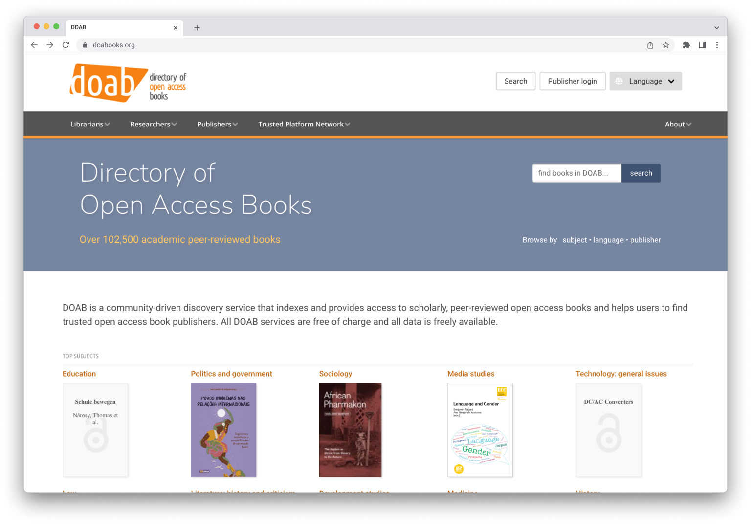 | 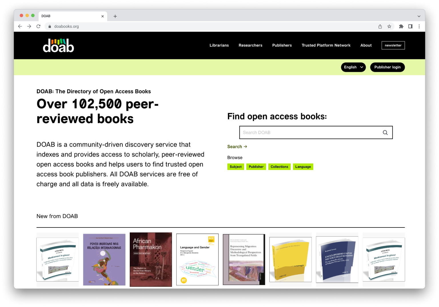 |
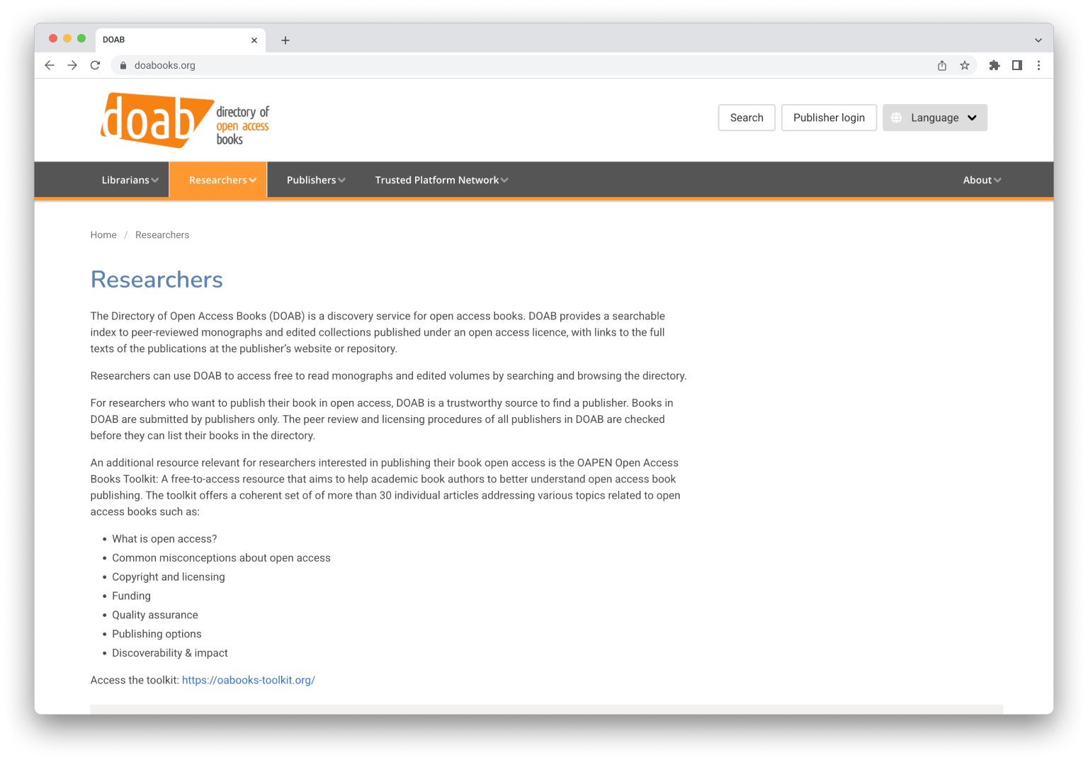 | 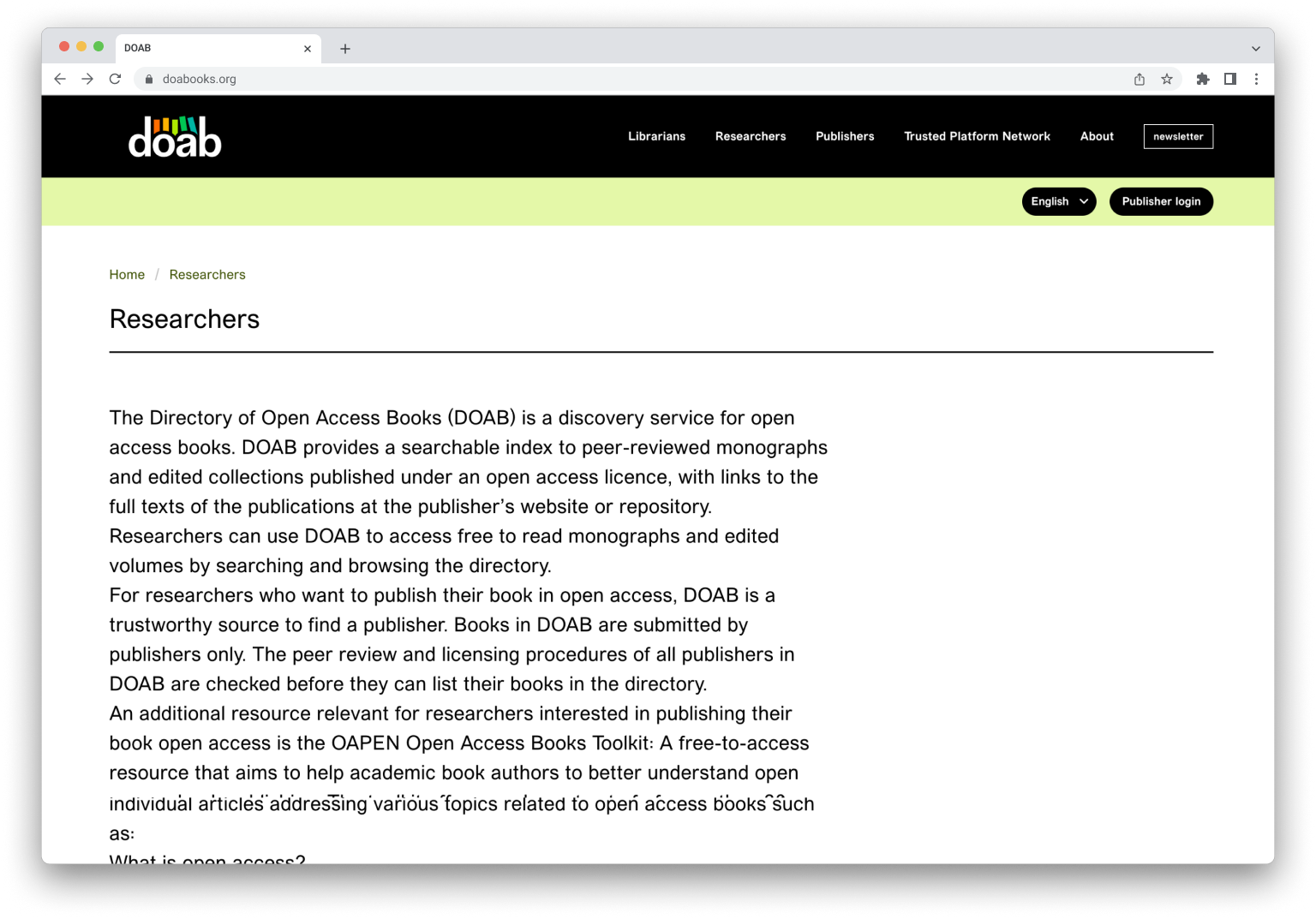 |
Our updated identity captures the mission and vision of DOAB expertly: to curate a global, open, and trusted index of open scholarly books and to make all scholarly books openly available to everyone.
The new logo is simple, clear, and most importantly, embodies the friendliness that we believe DOAB and its community exude. Our decision to move away from the traditional orange historically associated with open access (and DOAB) gives us the opportunity to expand DOAB’s association as an established global community. Like a bookshelf reflecting a reader’s interests, DOAB’s logo reflects our commitment to bibliodiversity, inclusivity, and collaboration.
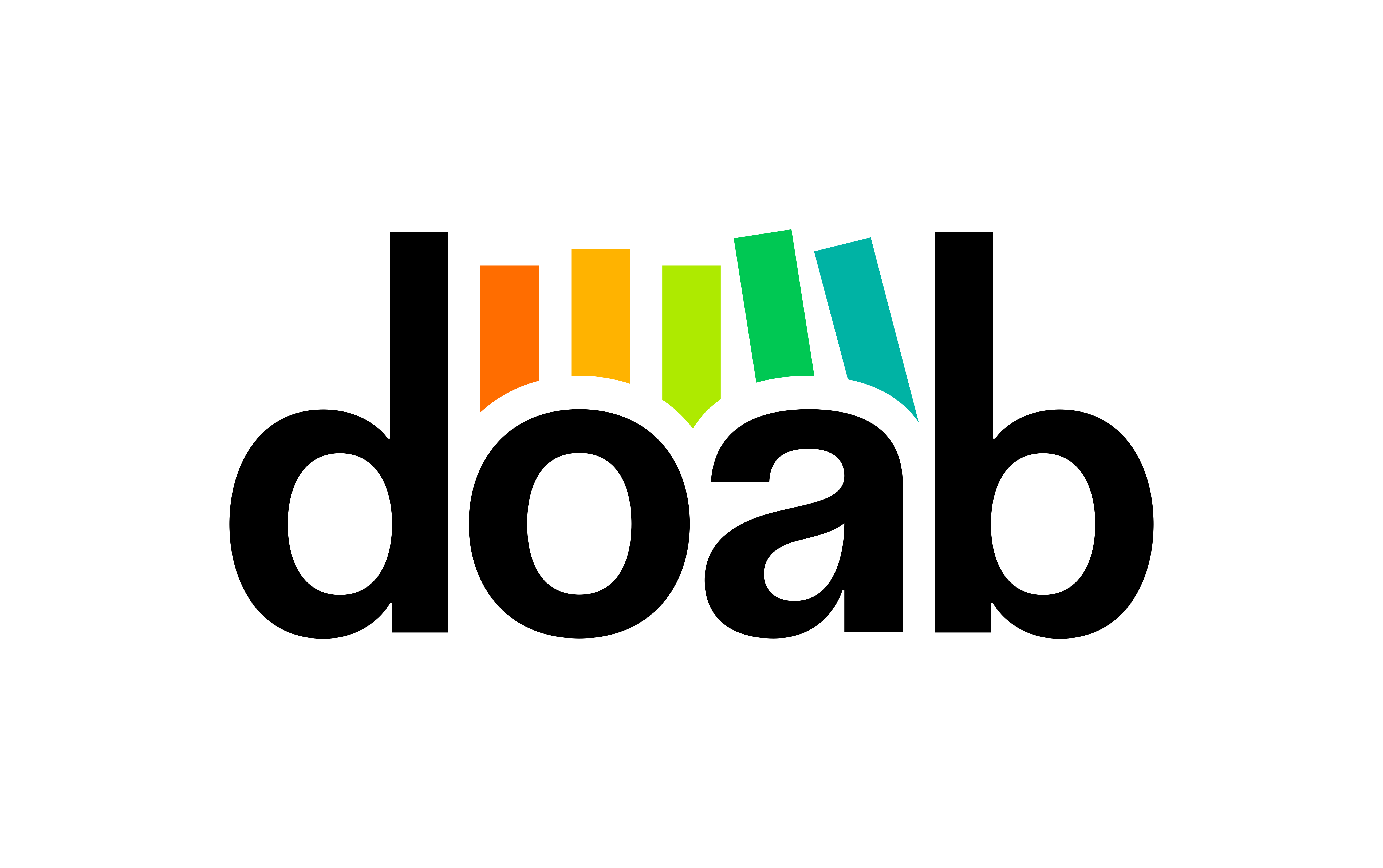
It can be interpreted in many ways, and we’re curious to hear how our community interprets it as we begin the transition to implement the new look everywhere we need to, and ensure a smooth and thoughtful transition.
We hope you enjoy interacting with DOAB’s new visual identity and are as proud to be part of its community as we are to steward it.
Download the new logo.